Be a Pro. Know the Terminology of Video Evaluation Metrics
You may or may not be aware of it but every time you sit down to watch a film; you ask yourself “what am I looking at?” and “Do I like this?” Personal interests regarding subject matter, artistic taste, and personal beliefs aside, I am referring to the quality of the picture itself. Pretend you like the film and have been looking forward to seeing it. Would you like it if the colors mismatch, the image seems blurry, or the details in the image don’t really pop out clearly? You are spending time and paying money for this so of course you want the picture to look good.
Think of your audio-visual (AV) experience in the same terms of enjoying fine wines or savoring the excellence of 5-star dining. Just as professional Connoisseur, there are AV experts who make a life of showing people the difference between having good and having a superb audio-visual experience. Below are the key terms used by professional calibrators and network technicians to define the various elements of creating a video image. Learn this and earn your way to a place at the AV-Cool Kid’s Table. (Well…not really, but learn this anyway and AV experts will at least stop treating you like you have a head injury.)
They are:
- Dynamic Range
- Color Saturation
- Color Accuracy
- Resolution
What is Dynamic Range and Why is it Important?
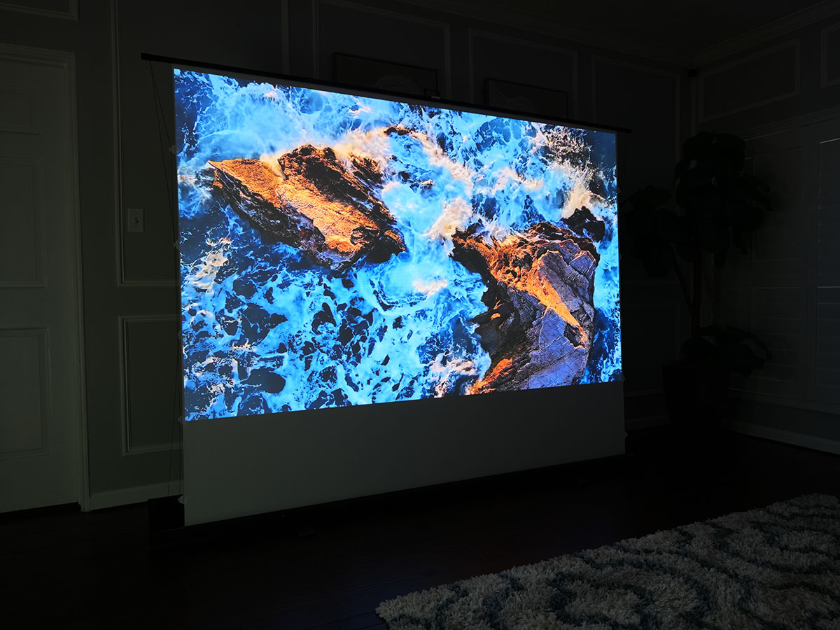
Dynamic Range is simply the points of measurement between the purest white and the deepest black that you can achieve with the equipment you have. Interestingly enough, this is the most important element of picture calibration. The reason for this is that the human eye sees detail in black and white.
Color perception is merely a further visual enhancement but without dynamic range, it is impossible for your eyes to see the various textures and details in imagery occurring at either the lighter or darker ends of this particular spectrum. This is also frequently referred to as “Black Levels”.

What is the Role of Color Saturation in Image Quality?
Color Saturation measures the various levels of intensity in image color. Think about viewing a picture of an orange. Do you want it to look,…well…orange? Or would you like the red color saturation to be so high that the orange is more “cherry” colored? Now, think about a picture of a human face. Regardless of ethnicity, flesh color is determined by combination of all the primary colors and among them is the color blue. What happens if you raise the blue color saturation as far as it can go? The answer is that the human face now looks like a smurf. Perception of the human face is literally distorted now that its flesh color is now blue. Here’s another example demonstrating how high color saturation literally distorts the perception of an image. A person who paints up their face up like the incredible hulk and passes you on the street could wash the paint off and pass you by a little later and unless they are wearing a distinguishing outfit or has particularly distinguishable facial features, it is likely you would not recognize them now that they have lowered the green color saturation of their face color. Likewise, take all the color saturation to the lowest levels and you are back to looking at an image in grayscale.

What is the Importance of Color Accuracy in Displays?
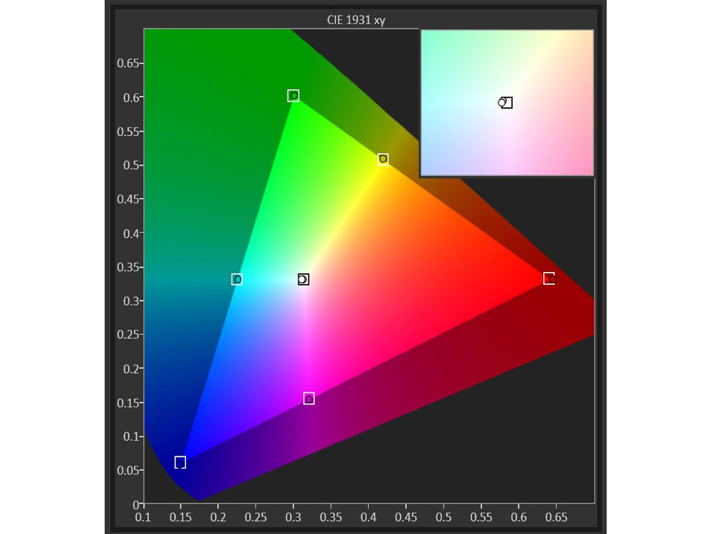
Color Accuracy (aka. Colorimetry) is balance of red, green, and blue signals used in video panels (devices) and projectors for the purpose of creating a color spectrum including most of the colors that the human eye can perceive. The varied levels of red, green, and blue combine in different levels of intensity to create the necessary colors that make a television, monitor, or projected image to replicate a scene as it would appear in reality. Notice the 3-corners of this semi-triangular design. One corner is green; the other blue; and the last is red. Notice the square in the middle of the Y-shaped whitish gray zones. This is the realm of color neutrality. The insert shows the “D65” region in greater detail.
Resolution is the level of clarity that is achieved in a video image. Modern video content is digitized meaning that each picture is made up of a large count of individual points of light called “pixels”. Simply put, the more pixels you can fit into a certain place, the more detail you will have. The illustration below shows in real time the size increase of each box using pixels that are of the same size. Think about this, the “DV” (green box) measures only 480 x 720 pixels whereas the “4K” (gray box) measures 2160 x 4096 pixels. Obviously, the gray box is bigger because the pixels in both are the same size. But what if the 4K’s pixels could shrink down to fit entirely into the DV-box? The image clarity would be very detailed. But if the DV box’s pixels were enlarged to fit the entire 4K box, the image quality would look like Minecraft with very “blocky” designs in very poor in its detail….or…resolution.

These terms represent the basic metrics used by the pros to calibrate anything from a TV screen to large commercial theaters as well as calibrating the very picture performance of big-budget Hollywood films. Knowing these metrics gives you the first steps in becoming an industry pro. Dynamic range and color saturation creates image contrast and clarity. Color accuracy represents how color calibration comes into play and resolution represents the levels of detail in your video image. Now go get some popcorn and enjoy the show like a pro.
-DR