Black-White Levels or Black-White Dynamic Range, Color and Contrast
I really had to fight off the peer pressure of my associates in the AV world to avoid toning down the complexity of this subject but it needs to be put into more layman-friendly terms. This topic has been covered in all its glorious intricacy by best minds in organizations like SMPTE, CTA, ISF, & CEDIA. This version is for the consumer to gain a basic understanding to build from.
To understand Black-White levels of contrast, here are 3 characteristics of any perceived color that you should know.
- Color Saturation: This is the intensity of a color. Think of a glass cup full of red paint and how it gets lighter with every drop of water you use to dilute it. The color is lighter because the color saturation is lower. The color is fuller when color saturation is higher.
- Hue: This represents the full range of colors that can be seen. This incorporates the full Red, Orange, Yellow, Green, Blue, Indigo, and Violet color spectrum.
- Luminance: The measured presence from the black-white dynamic range that occurs with a measured point of color. It determines the brightness or darkness of an image. This is broken down to Tint (adding white to the color) and Shade (adding black to the color).
Black Level Dynamic Range
Fig. 1: Black level dynamic range is simply the full range between the whitest white
(where RGB occurs in the same saturation level) and the blackest black (where no color saturation exists at all).

There is often confusion between the definition between the word “Contrast” and “Black-White Dynamic Range “(aka. “Black Levels” – See fig. 1)”. While contrast can describe how lighter and darker portions of an image differentiate from one another, that’s only part of the story. Although, black-level dynamic range can enhance contrast, the same can be said about varying levels of color saturation whereas a more deeply saturated color will “contrast” with a lesser saturated color in the same spectrum. (See fig. 2.)
Dynamic Range incorporates the points of measurement between the purest white and the deepest black that you can achieve with the equipment you have. Interestingly enough, this is the most important element of picture calibration. The reason for this is that the human eye sees detail in black and white.
Color perception is merely a further visual enhancement but without dynamic range, it is impossible for your eyes to see the various textures and details in imagery occurring at either the lighter or darker ends of this particular spectrum. This is also frequently referred to as “Black Levels”.
Keep in mind that true black is not an actual color but the mere absence of any light in the spectrum. For this reason, a video image can never be truly “black”; it can only present a minimal presence in color.
Color Contrast
Fig. 2: Color Contrast shows the difference in color intensity or color saturation. The measurements are from the maximum possible saturation of 255 integers as seen on an 8-Bit computer program that we are using here for simplicity.
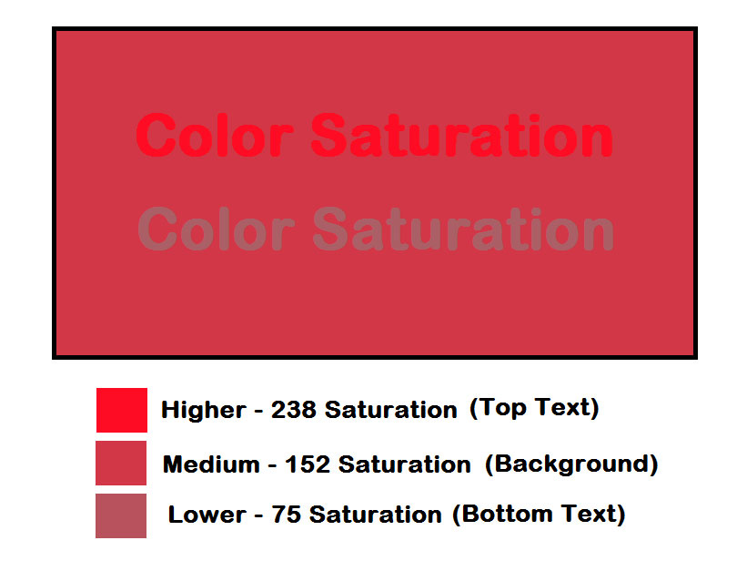
- *Top text = high (238) saturation
- *Background = med.(152) saturation
- *Bottom text = low (75) saturation
All 3-colors share the same Hue (236) and Luminance or black-white (125) integers.
The human brain interprets all its perceived color signals in Red, Green, and Blue or (RGB). It is from these three colors that the human brain interprets the various hues or ROYGBIV (red, orange, yellow, green, blue, indigo, & violet) based on the varying levels of RGB present to create any given color.
In summary while it’s easy to tell different colors apart from one another, there is more to the story about contrast than just black and white. The intensity of color matters just as much.
-DR