Lunette Series – Home Theater Magazine
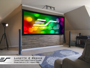
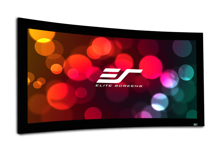
At one time, two of my favorite Los Angeles–area theaters were in Westwood: the Village and the National. The Village had, and still has, a huge, flat screen. The National (tragically closed and torn down in 2008) had a gently curved one of about the same size. While the Village had the more awesome audio, I always preferred the subtly more immersive visual presentation at the National. For that and other reasons, I’ve always wanted to try a curved home theater screen but generally considered them poor values. Enter Elite Screens, whose retractable Osprey design I reviewed in these pages (Home Theater, October 2011). That company now offersa range of fixed-frame, curved models—the Lunette Series—at surprisingly affordable prices. Two different screen materials are available for the Lunette: Elite’s CineWhite®, with a specified gain of 1.1, and the company’s AcousticPro1080a, a woven, acoustically transparent material said to have a gain of 1.0. Since the AcousticPro1080 increases the price of the screen rather dramatically, we went with the CineWhite®.
The Lunette’s wide, curved frame is covered in a nonreflective black velvet. The back of the screen is blackened to eliminate light penetration (a feature many more expensive screens don’t offer).
Setup of the Lunette was easy, primarily because Elite assembled it for me while I watched! (Elite’s
U.S. offices are located within easy driving distance of our studio.)

But it didn’t appear to be a major challenge, though I’d recommend at least two people be on hand for the job. Once set up, the Lunette’s curved surface was uniformly smooth and wrinkle free. Elite furnished us with a stand (not commercially available) for our temporary review setup. The screen is normally wall mounted.
There are two primary disadvantages to a curved screen. First, retractable versions are not available from Elite—or any other manufacturer to our knowledge. And second, a large concave surface can do weird things to the room’s acoustics. I couldn’t check for the latter, but the Lunette’s curvature is so gentle, I suspect its acoustic impact will be nil.
Viewed from just inches away with a bright, stationary test pattern, the CineWhite® screen material had subtle, visible texturing. It was noticeable only because of its absence on our reference Stewart Filmscreen StudioTek 130. But it was not visible at a comfortable viewing distance on normal program material.
I also saw a hint of pincushion distortion, visible as a slight curvature of horizontal lines at the top and bottom of the picture. But with careful setup, this was invisible on anything but test patterns. Elite claims that a curved screen eliminates pincushioning, but that likely depends on the design of a projector’s lens (whether or not it’s corrected for an assumed flat screen) and the vertical position of the projector (in our tests, the projector was located slightly below center screen).
My prior positive experiences with that flat Elite screen using the same screen material largely told me what to expect, and I wasn’t disappointed. The picture quality was uniform from one side of the screen to the other, even at ridiculously wide viewing angles. Colors popped beautifully onKung Fu Panda 2, and the resolution on the Elite from this disc was little short of astonishing. Prometheus, though far darker and offering less colorful eye candy, was just as impressive in its own way.
I loved what the curved screen did to enhance the cinematic feel of movies, and if my home installation allowed for such a screen (it doesn’t—I need a screen that retracts), I’d choose the Elite Lunette without hesitation.
HT Labs Measures
Both the Elite Lunette and the Screen Innovations Black Diamond 4K screens were measured against our Stewart Filmscreen StudioTek 130 reference for both color consistency and brightness loss from the center to the sides. Any such measurements will include the effect of both the screen and the projector. We have no way to reliably isolate the two; therefore, the measurements here should be used for comparison only. All measurements here were made with our meter located at a centered position, just behind the projector. A center reading was taken first, then readings at 75 percent left and right. The measurements on all three screens were somewhat worse at the right side of the screen than the left, suggesting that the differences were related to the projector in some way (though they were not visible to the eye). Here we show only the worst-case, center-to-right side results.
Different screens will require different calibration settings, so the Sony projector was recalibrated for each screen prior to taking any readings. The gray-scale results are shown in the accompanying table as the average Delta E. Delta E is simply a figure of merit that shows how closely the gray scale adheres to the HD color standard. The lower the number, the better, and most experts agree that readings under 3 to 4 will appear visibly uncompromised to the eye. While the Screen Innovations has the most deviation, it’s likely that the screen itself had less to do with that than the projector. None of the color deviations from the center to the side shown here were obvious on normal program material. What was clearly visible was the loss of brightness from screen center to 75 percent right on the SI screen. An important part of the SI’s design is its ability to reject light coming at it from an angle. Unfortunately, such a screen can’t differentiate between a table lamp located at an angle to the screen and the light coming from the projected image and hitting the screen at the same angle. —TJN

